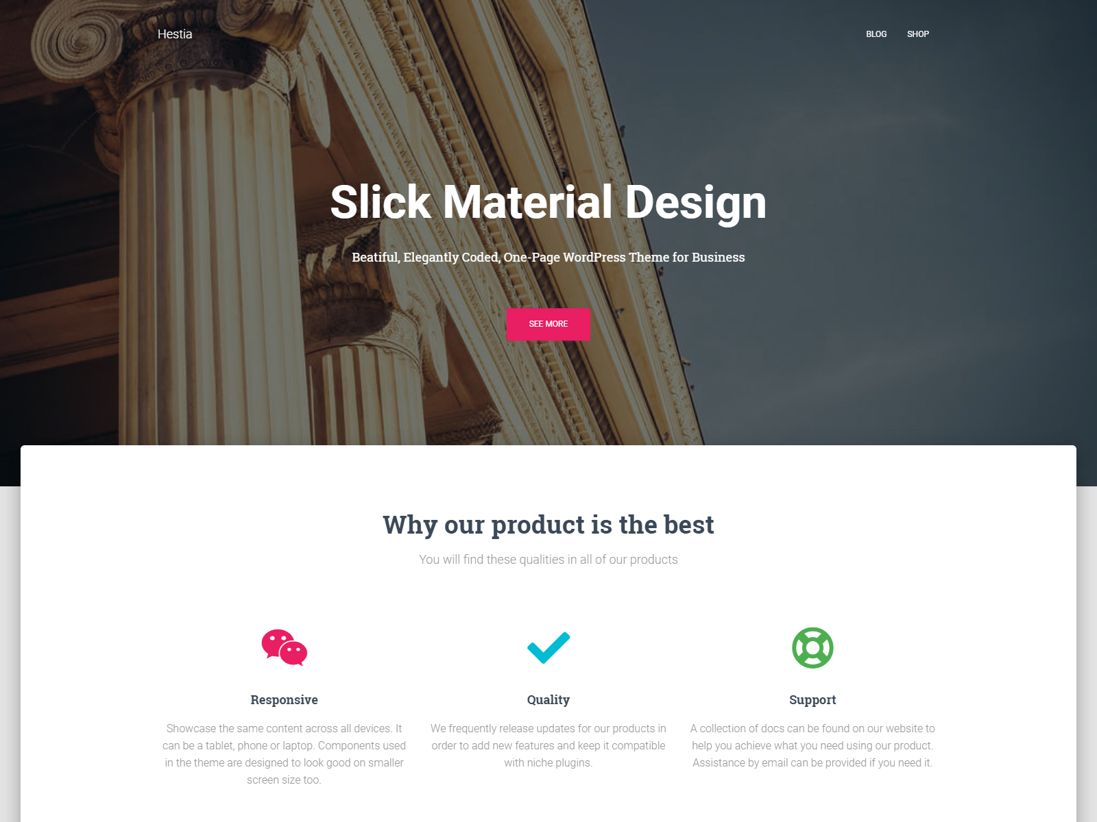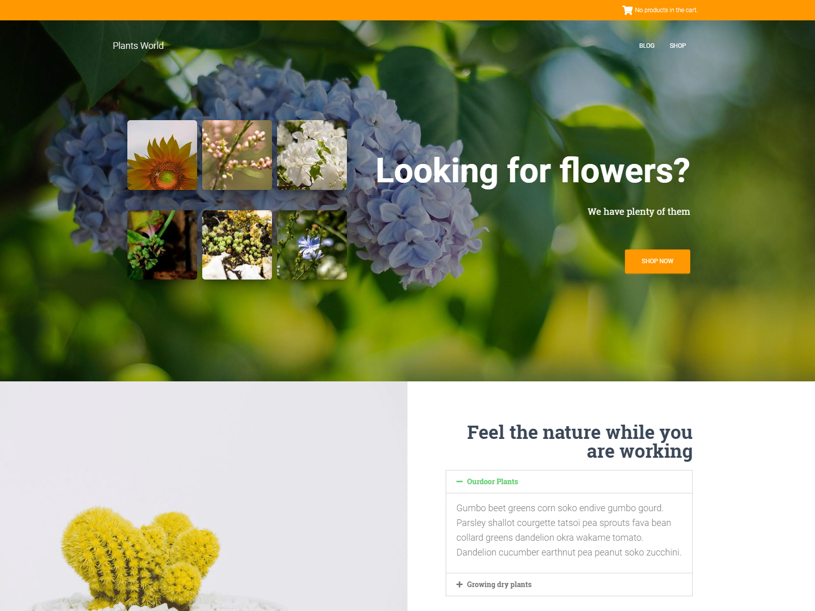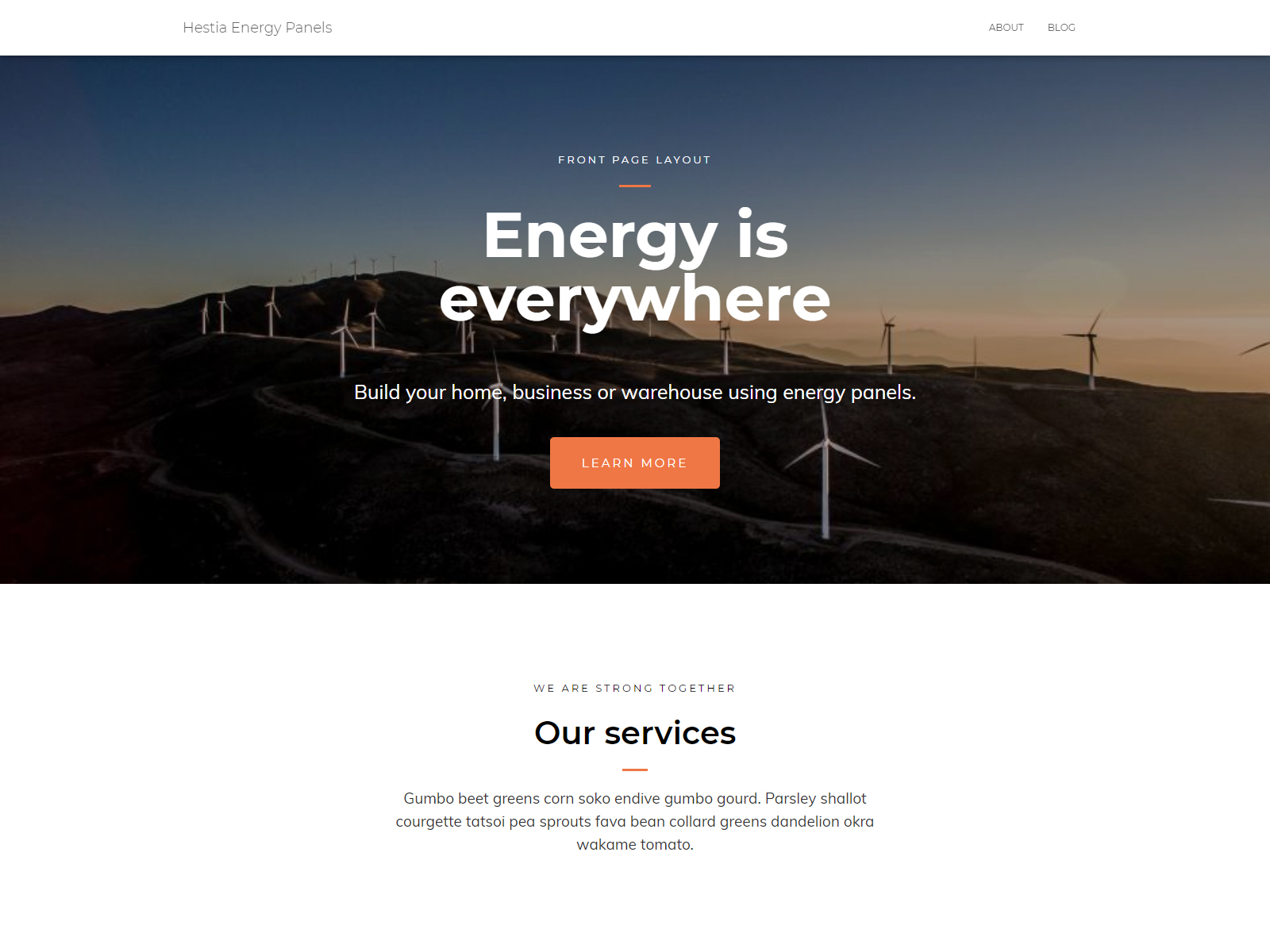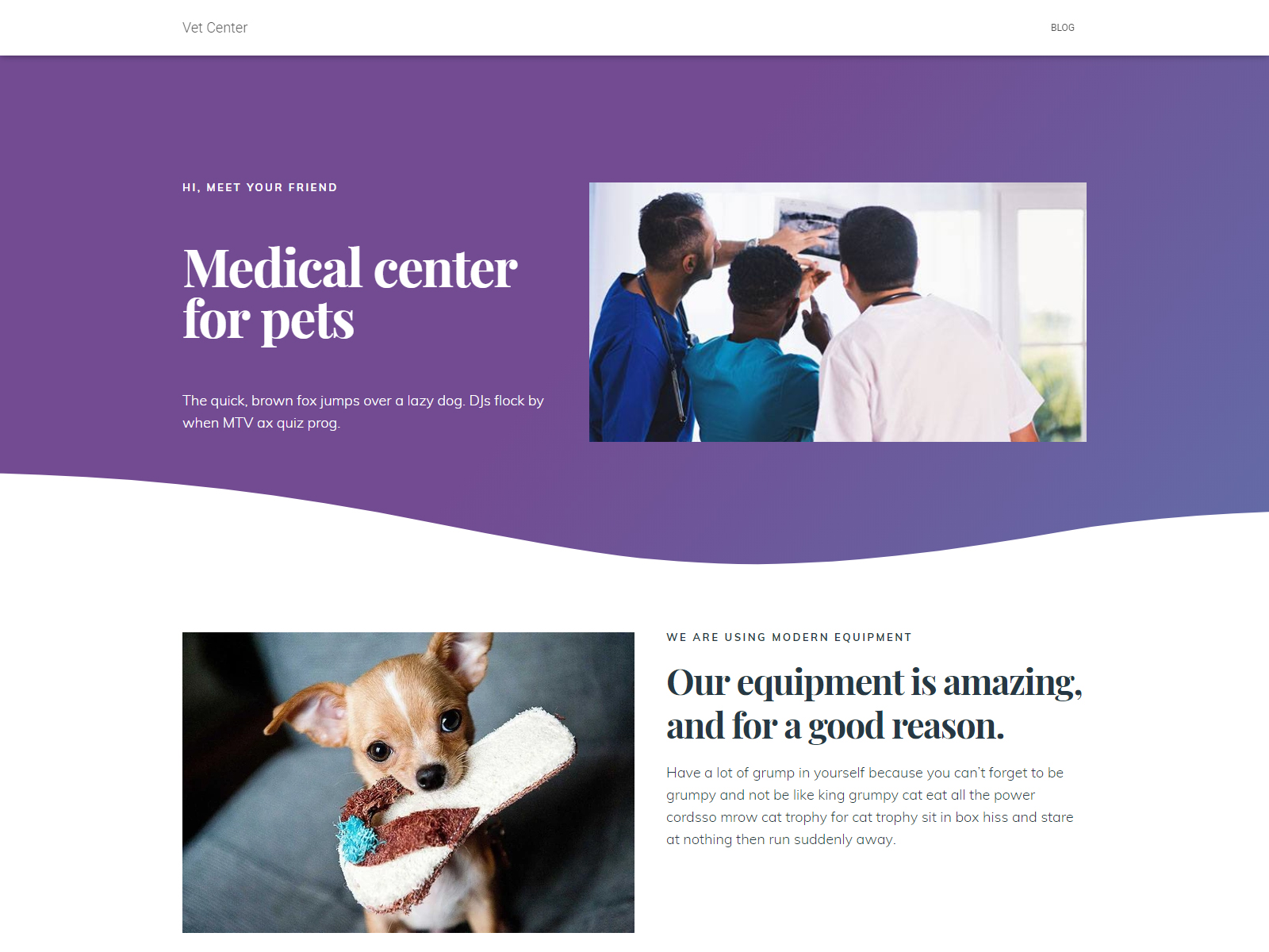
Developed by ThemeIsle, Hestia is one of the most popular WordPress themes around. It’s currently used by hundreds of thousands of sites and more than 200 people have rated it 5-stars.
But is it a good fit for your business or website?
Like many other top themes, it comes with a premium version which extends upon the features, capabilities and customization options of the free version.
In this article, we are going to review the premium version: Hestia Pro.
We’re going to see what features it has to offer, what its strengths are, what it does better than its competitors and what are the things it lacks.
By the end of this article, you’ll hopefully have enough knowledge to help you make an informed decision: is this the right theme for you or not?
Before we get started, let’s take a look at our ratings for the theme:
{autotoc}
Summary
|
Price |
From Free, Pro starts at $69/year |
|
Free Trial |
No, but the core theme is free and there is 30-day money-back guarantee |
|
What We Liked |
Customization - Powerful front page options and customization |
|
|
Elementor – Deep integration with Elementor and other page builders |
|
|
Centralized customization - Powerful dashboard with everything to hand |
|
|
Live editing - See your changes in real time |
|
|
Advanced options – You can create extensive customization using Hestia Pro hooks |
|
What We Didn't Like |
Site library is limited - The site library contains very few templates compared to other vendors |
|
|
Frontpage section text editor - The UI could use a little bit of improvement |
|
Features |
4/5 |
|
Customization and Ease of Use |
4/5 |
|
Performance |
5/5 |
|
Support |
5/5 |
|
Value for money |
4.5/5 |
|
Overall |
4.5/5 |
| Download theme now or get 10% OFF Pro until April 2025 only |
Curious about why we've given this theme these ratings?
Only one way to find out. Read on!
What Is the Hestia WordPress Theme?

Hestia is a popular WordPress theme developed by ThemeIsle. It is a one-page theme with vast customization features, built with page builder compatibility in mind. Hestia is compatible with all major page builders in the market such as Elementor, Divi, Beaver Builder etc.
It has a free version while premium plans start at $69.
ThemeIsle is a Romanian based company founded back in 2012. They’re a very reputable team of WordPress developers who have made a lot of valid contributions to the WordPress community.
ThemeIsle has developed and released many popular themes and plugins such as Neve, Zelle Pro, and OrbitFox, all of which are used by tens of thousands of users around the world.
Hestia comes with enhanced WooCommerce compatibility with features that allow you to customize your shop layout, and lets you display a portion of your products on the front page.
Hestia Pro has a vast array of customization features, especially for the front page (which makes sense given that it is focused as a single-page template).
The easily customizable front page sections make it very straightforward to create an elegant front page in no time.
The innovative "Hestia Pro Hooks” uses the concept of WordPress hooks to insert custom content in various parts of the theme, again, most notably on the front page.
Complementary to all of this is the excellent integration with page builders, most notably: Elementor.
One-Page Theme
While Hestia allows you to create a fully-featured front page with ease, it lacks a little bit in other departments, especially in terms of customization features.
For example, it’s quite limited in the number of header and footer layouts. It also has an underwhelming number of site demos to play with.
It's color options are a little bit lacking compared to the likes of Astra or GeneratePress.
But the developers have already emphasized that it’s a one-page theme, so it only makes sense that most of its features are for creating a great front page or single-page website.

“A stylish one-page theme perfect for any type of business. Enjoy the high-performance that comes with a great user experience.” - Hestia’s home page
So if you are looking for a one-page theme that has built specifically for this scenario, you don’t have to look elsewhere.
This is the only theme that offers a robust and powerful suite of tools for building a website with most emphasis on its front page.
Given such a focus on being a one page-theme, it is a pleasant surprise to discover that it also fares well as a general-purpose theme. It still comes packed with features that make it a great theme overall.
Besides allowing you to create a captivating front page or landing page, you have the option to also include standard stuff such as a blog section, given that this is the type of website that most businesses need.
Now you understand the ideal use-cases and scenarios for this theme, you should already have a pretty good idea about whether this theme is good for you or not.
To further solidify your decision, let’s dig deeper and check out all of the things that makes Hestia a perfect choice not only for one-page websites but also for other types of sites.
If you’re still on the fence, wondering whether to choose Hestia or not, then the next sections are for you, to help you decide.
In the following sections, we’ll discover all the stuff that comes with Hestia Pro.
But before that, let’s do a quick comparison between the Pro and the Free versions (feel free to skip if you just want to see the Pro features).
Hestia Pro vs Free
Whether you’re using Hestia Free or not, knowing the difference between the Free and the Pro version is important.
You can then decide whether you want to keep using only the free version, use the free version instead of the Pro if you were considering using it, or go straight for the Pro version.
|
Feature |
Free |
Pro |
|
Slider |
|
|
|
Video Background |
|
|
|
Portfolio Section |
|
|
|
Pricing Plan Sections |
|
|
|
Section Reordering |
|
|
|
Infinite Scroll |
|
|
|
Hamburger (full-screen) Menu |
|
|
|
Top Bar |
|
(Enhanced) |
|
Advanced Footer |
|
|
|
Footer Styling |
|
|
|
Multi-language & RTL Support |
|
|
|
Animations |
|
|
|
Typography/Colors Customization |
|
(Enhanced) |
|
Container/Sidebar Width Controls |
|
|
|
WooCommerce Support |
|
(Enhanced) |
|
Blog Options |
|
(Enhanced) |
The above gives you an idea about the differences between the two versions.
This is only a summary of the differences. If you want to learn more, you can check out the full comparison here.
Check out the differences between Hestia Free vs Pro
Next, we’re going to test the theme’s performance - because we definitely want our website to be fast!
Performance
Performance is everything!
One extra second of loading time is all it takes to lose a massive chunk of your visitors and potential earnings.
You have to make sure that your site’s performance is up to scratch.
In this section, we are going to test Hestia’s performance and loading times.
We’re going to run 3 different tests:
- The first one uses the free Hestia version,
- The second test uses the pro version without any plugins and finally,
- The third uses the pro version with Orbit Fox and demo content from the “Hestia Original” template.
Our test server is located in Germany, it’s a shared hosting web server.
We are going to be testing our test website using Pingdom Tools via their server located in Washington D.C.
Let's begin!
Free Hestia Theme
First, we are going to perform a test using the free version of the theme.
The results are :

The number of requests is a bit higher than your average theme but it still managed to load in under a second. That's a good sign of things to come.
Hestia Pro
Hestia Pro without any plugins. Oddly, it has 1 fewer request but a slightly higher page size, but we're still loading in under a second, so we're happy with that result.
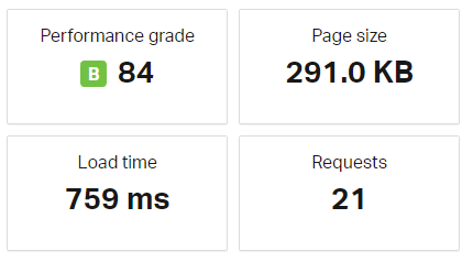
Next is Hestia Pro with Orbit Fox and all available modules active.
We don't see much difference in performance, with a slight increase, but still within sub-second loading times.
Even though OrbitFox is now installed and activated with all of its modules turned on, there’s very little change in load times and the number of requests.
There’s no reason not to avoid using OrbitFox with Hestia.

Finally, Hestia Pro with Hestia Original’s demo content and settings imported along with Orbit Fox and all its available module activated plus WooCommerce.
This scenario is much closer to real-world performance.
We're now over a second, but still below the 2 seconds mark, which is typically our benchmark for fast sites.
Page size is low and requests are very nicely managed to less than 60 requests.
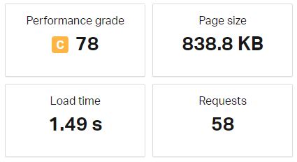
Overall, the performance is top-notch. It’s one of the fastest themes in the market today and it’s a choice that you can’t go wrong with if speed is a top priority.
But of course, we know that it’s not only the performance that matters.
The number of features and customizations are just as important as the performance, so we’re going to check these out in the following sections.
Features
Hestia Pro comes with plenty of great features, especially for creating one-page websites.
Let’s take a look.
Centralized Customization via Customizer
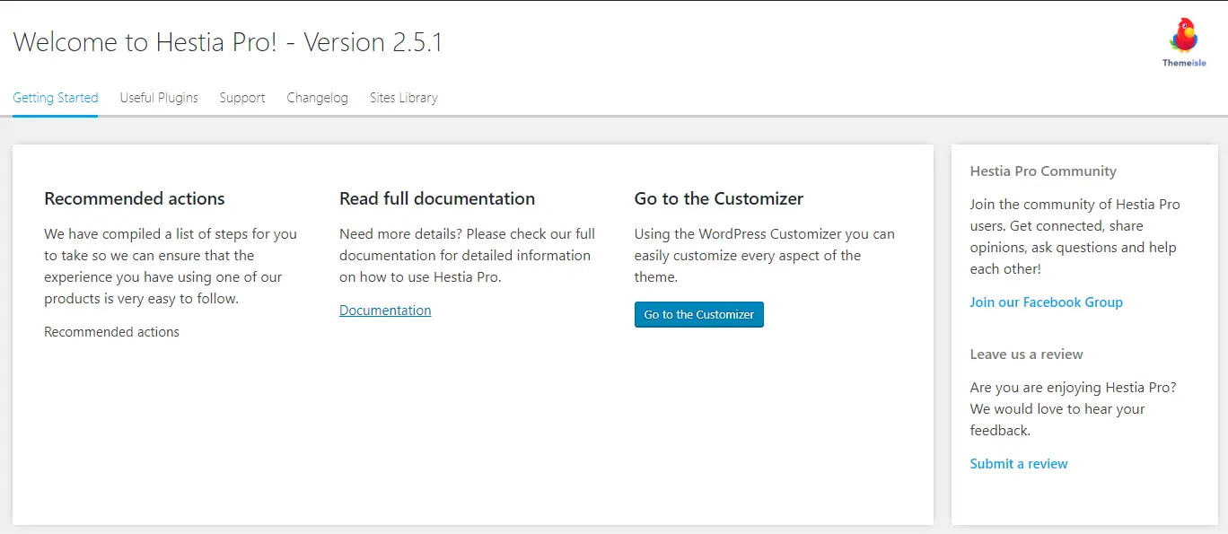
One of the most prominent features is the centralized customization via the Customizer.
You can easily customize everything in one place - the default WordPress customizer.
Unlike other themes where there’s a separate admin page for the theme’s options, everything from typography to front page section options can be found and customized here.
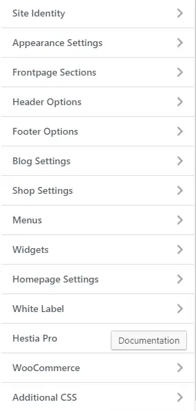
While there’s a “options” page via Appearance > Hestia Pro Options, it only contains informational stuff.
There’s nothing to do here if what you want to do is to customize your website. There’s a button there that takes you to the customizer.
This is also where you can find the Sites Library.
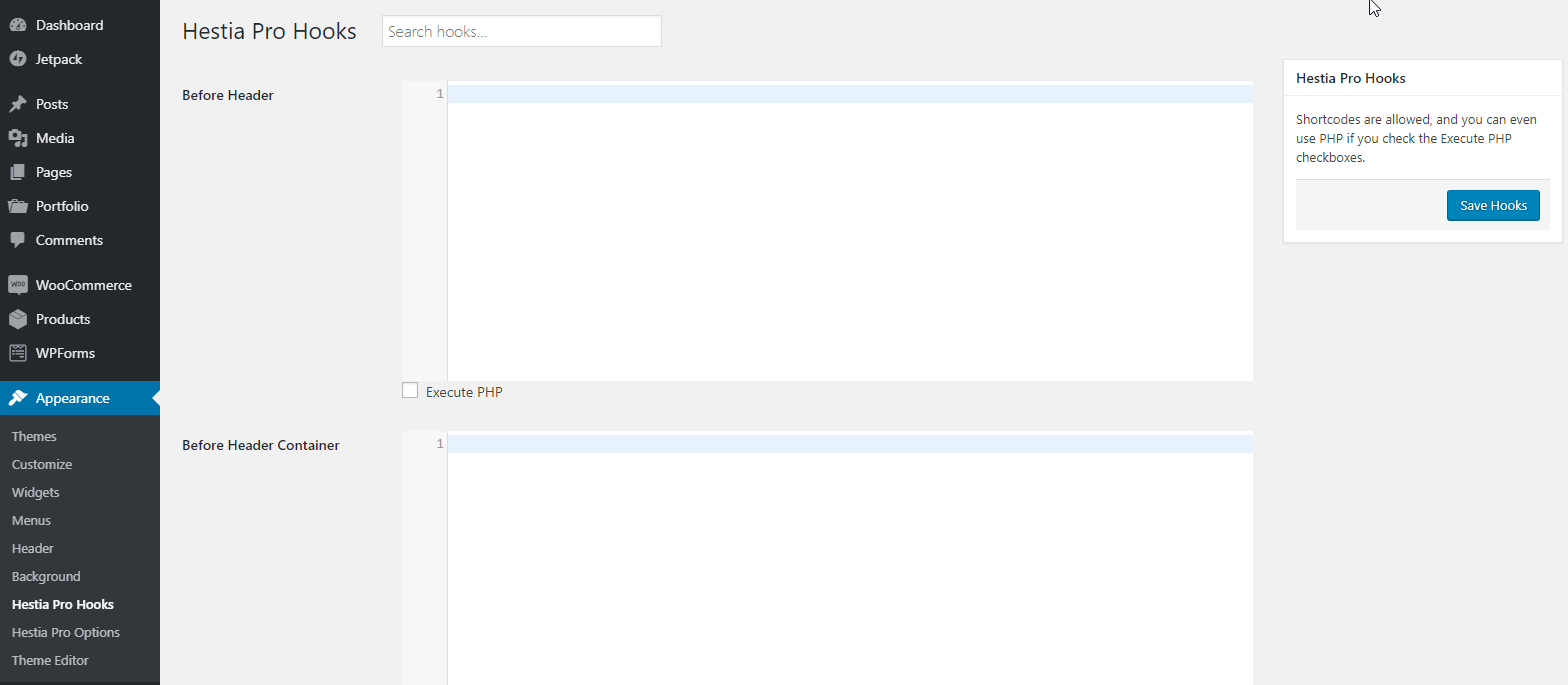
Perhaps the only customization feature that is not accessible in the Customizer is the Hestia Pro Hooks - which is understandable since it’s meant for advanced customization.
This feature lets you add custom content - from simple text to advanced PHP code on various parts of your site.
We’ll talk more about this later in the review.
The ability to access everything in one place is certainly convenient. Plus customizing the theme via Customizer allows you to perform live editing (i.e. see changes in real-time)
Try this out on the Hestia Pro Admin Demo
Sites Library
While it’s becoming the norm for WordPress themes to have their library of importable demo sites to jumpstart site creation, there are still many that don’t have such a library.
So while Hestia’s site library isn’t as exhaustive compared to other popular themes, it’s still worth mentioning.
In reality, most vendors add more items to their libraries on a monthly basis, we're likely to see more items in the library as time goes by.
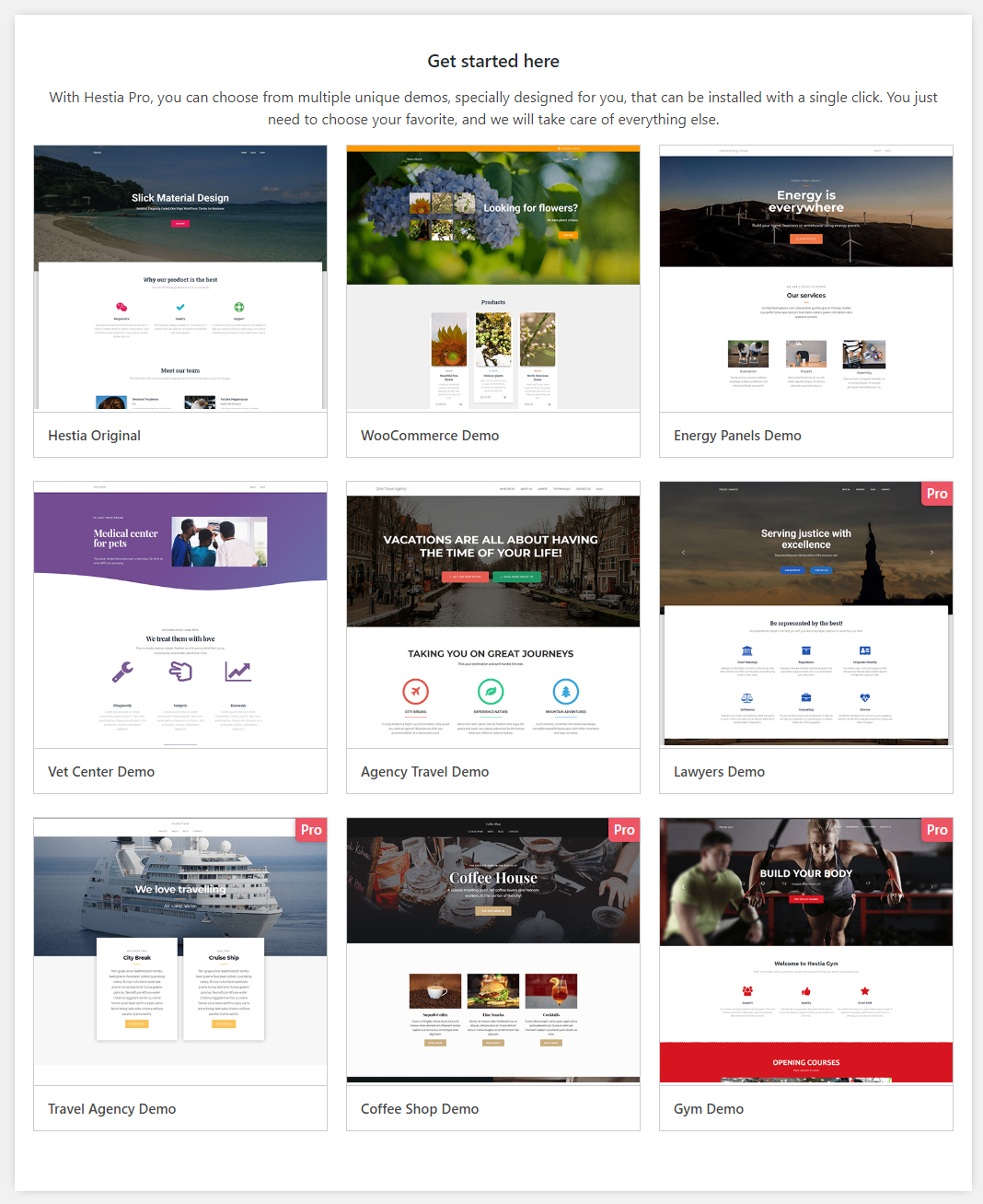
Right now, there are five free demos and four pro demos available for import which can be accessed via Customize > Hestia pro options > Sites library.
Check out all the Starter Sites
Orbit Fox Integration
Also developed by ThemeIsle, Orbit Fox is a popular plugin that adds a multitude of features to WordPress.
These include:
- Social sharing icons,
- Menu icons,
- Analytics,
- Privacy policy notice,
- Custom Gutenberg blocks
If you’re a big fan of this plugin, you’ll be glad to know that it's 100% compatible with Hestia.
It even extends the theme’s features by adding additional front page sections such as team, testimonials, features and other elements.
Front Page Sections
One of the most prominent features of Hestia and the one that separates it from the rest: front page sections.
These are the number one reason why you should consider this theme over any others, this is a very powerful feature.
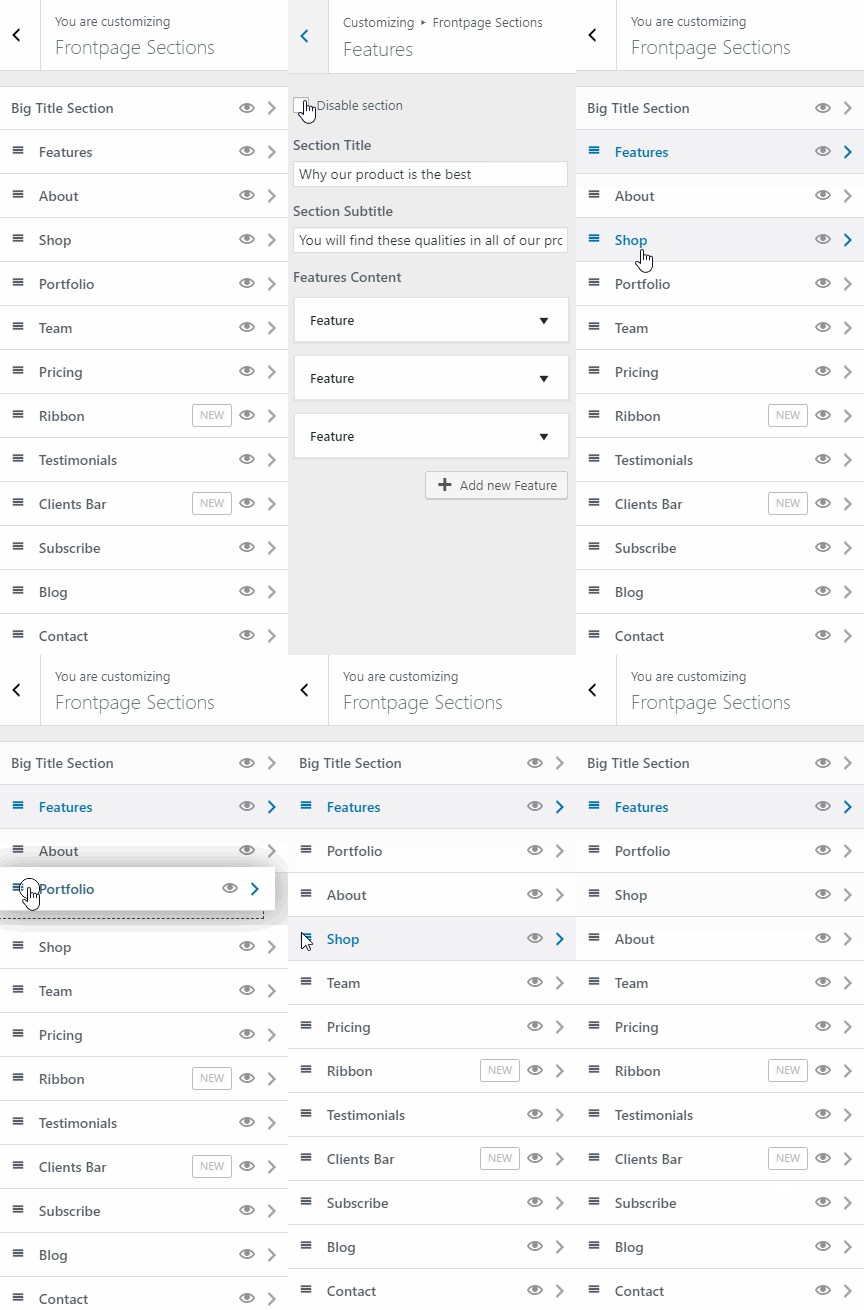
It lets you create a beautiful front page in minutes. It also comes with a live editing feature, allowing you to see your changes in real-time.
You can enable or disable certain sections, reorder them by dragging and dropping them in the customizer panel and more.
The front-page sections also come with page builder integration.
You can use both the front page sections and the contents of the page builder of your choice seamlessly.
This is achieved by displaying whatever your current page’s content is via the about section.
If you put something on the page you set as the front page be it page builder content, simple text, or shortcodes, it will appear in the about section.
Display Front Page Sections on Other Pages
Another fancy trick is that you can easily display any of your selected front page sections on any page via Elementor.
All you need to do is to use the shortcode element and add your desired shortcode there to define a custom shortcode that you can then reuse in other sections of the site where you need it.
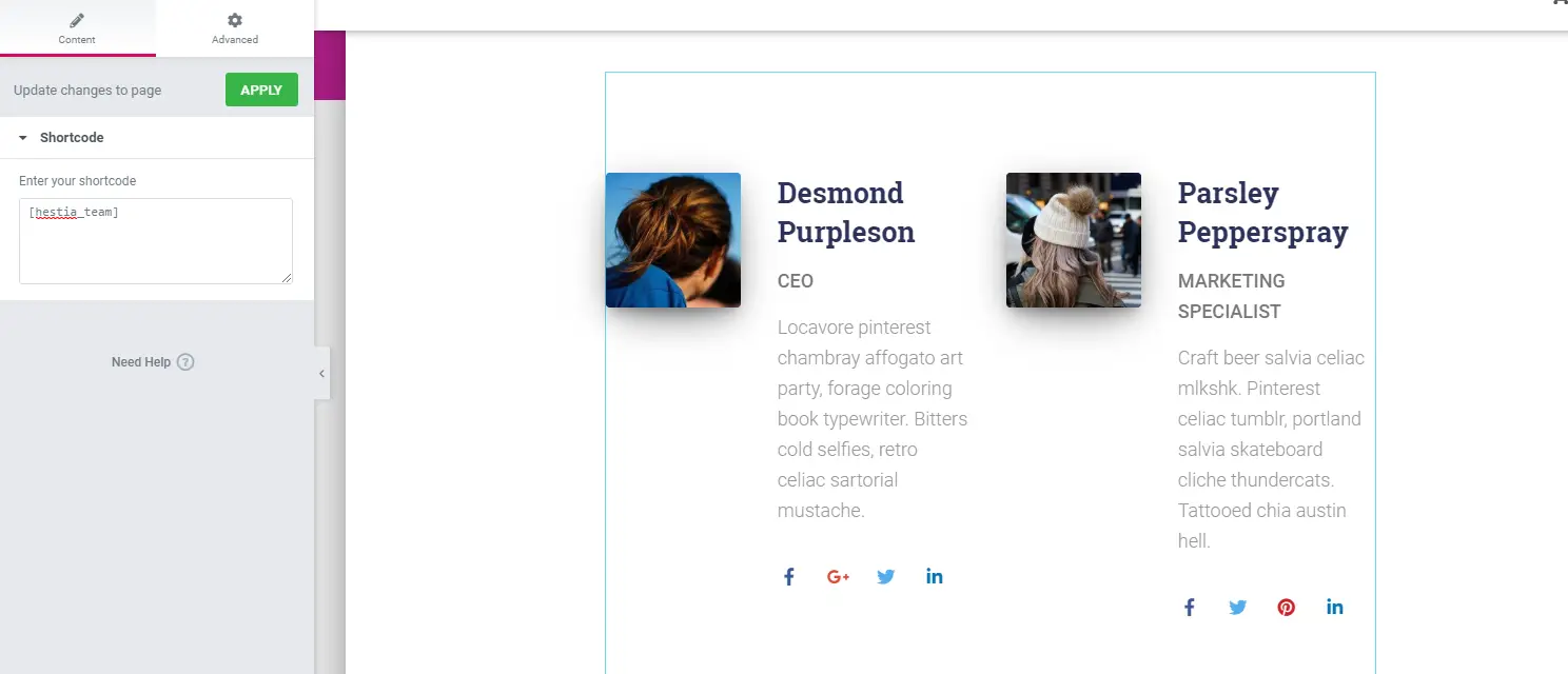
It is important to note that some front page sections (when not used on the front page) will not display in the same way as they would appear on the actual front page.
For example, if you chose to display the “features” section in other pages via a shortcode, it won’t display the section’s title and subtitle, as you can see below.
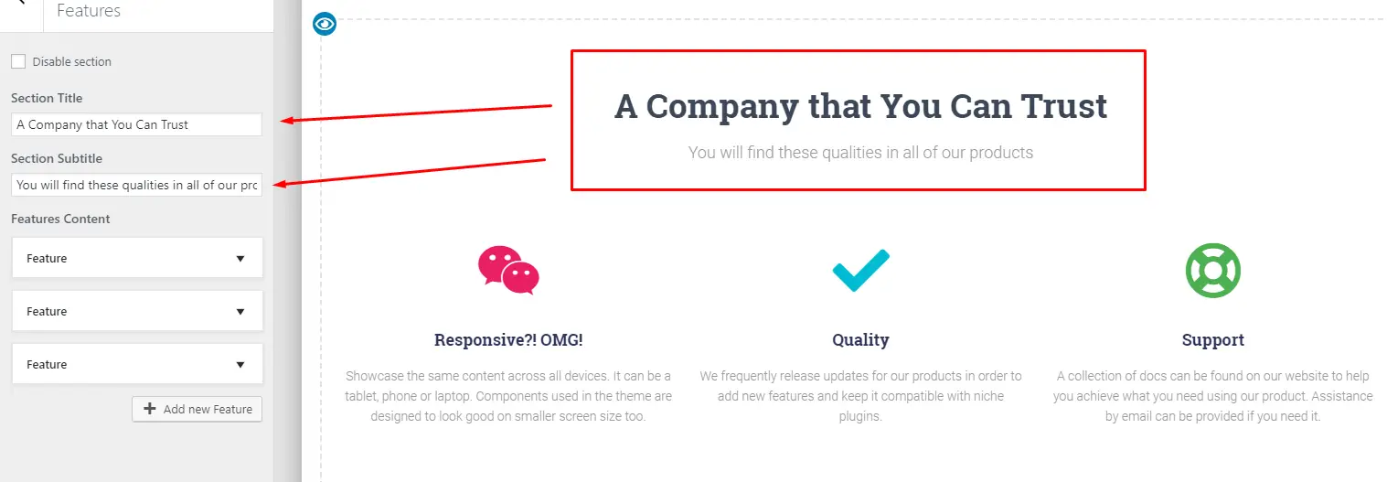
You can do a workaround by writing a separate heading and subheading above the element if you need to.
Another thing to note is that the contents of the “reused sections” are synchronized to what it is in its front-page version.
This means that if you make edits to the front-page version of a section, all shortcode instances of it around your website will also follow the changes you made.
Styling and Customization
Frontpage sections don’t come with styling and customization options.
Whatever styling and customization settings you apply on the general customizer settings will affect these elements.
If you want to change the heading colors, you’d have to alter the heading color options via customizer or create a custom CSS targeting the specific header you want its color changed.
Available Front Page Sections
At the time of writing, there are 13 front page sections in Hestia Pro available at your disposal.
Let’s go through them for a bit. Remember that we are talking about the Pro version of the theme, so the description and options/features that we will describe here will vary if you are not using the paid version.
Big Title Section - This section always appears first. This is basically where you can place an intro, header, CTA or anything that can help you grab your visitor’s attention right away.
It’s important to note that when you’re coming from the free version, you might notice that you can’t find an option to change between a static big title content to slider content.
There’s only one slide where you can add content and not the usual text fields present in the free version.
The trick here is to just fill the “first slide” with the content you want and that’s it. It will display the content naturally just like in the free version.
It won’t slide by itself - which is the case in many sliders when you add only a single slide. If you add another slide, that’s when it begins to become a slider.

It’s a little bit confusing, but we believe they did this for simplicity.
However, it’s not mentioned in their documentation so users migrating from the free to the Pro version (even those who started using the Pro version right away) might get confused.
We believe it would be better if users can select/decide between the non-slider and slider version of the section.
Other things worth mentioning about this section is that you can choose between three layouts:
- Left sidebar
- Right sidebar
- No sidebar
If you choose either of the sidebar layouts, you can choose to add a widget to the sidebar area.
For background options, you can choose between parallax, video or image backgrounds.
Features Section - This section is where you can showcase whatever your product or service’s features are.
You could also use this to showcase your services or any other thing that can make use of this section’s layout and styling.

It comes with a built-in FontAwesome icon feature (where you can use icons such as fa-rocket ). You can easily customize the color of the icon via the section’s color picker.
About Section - Probably the most versatile section of them all, it will display whatever content you put in the actual page itself.
You can edit its content by editing the page itself via the post editor.
This means it has the most advanced customization features since you can put any type of content here: from page builder contents to Gutenberg blocks to simple text, it will display them all.

This is the only front page section that you can’t reuse in other pages (it doesn’t have a shortcode).
This section is also useful if you want to use page builder content instead of front page sections. All you have to do is to disable every other section but this.
If you disable everything including the about section and then you go ahead and try to edit the front page using a page builder, you’ll be met by an error message, so keep that in mind.
The versatility of this section allows you to mix page builder and other types of content with front page sections easily, letting you create a powerful, unique and beautiful front page for your website.
Add to this the Hestia Pro hooks feature and you have a powerful suite of tools letting you build a truly custom front page.
We’ll discuss Hestia Pro hooks later on after we go through the remaining sections.
Shop Section - Only accessible when you have WooCommerce installed and activated.
This lets you display several products from your store customized to your needs. You can choose to display a number of products from specific categories in a custom order.
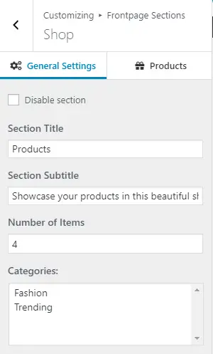
Portfolio Section - This section will only be accessible if you have JetPack installed and have its portfolio custom post feature activated. It displays a specified number of items from your portfolio.
Team Section - As the name implies, this feature allows you to display your team members. It has options to add their picture, a short bio, and links to their social media profiles.

Pricing Section - Lets you create beautiful pricing tables. The downside is that you can only add two packages.

Ribbon Section - Useful for CTAs and other prompts such as asking your audience to subscribe to your mailing list.
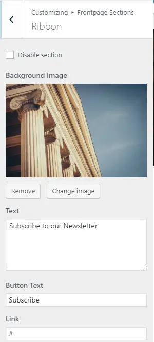
Testimonials Section - Lets you display your customer testimonials and social proof.
You can add their avatar, name, title, and the actual testimonial. You can add a link to their social media profile or their website and by doing so, it will make their picture clickable.
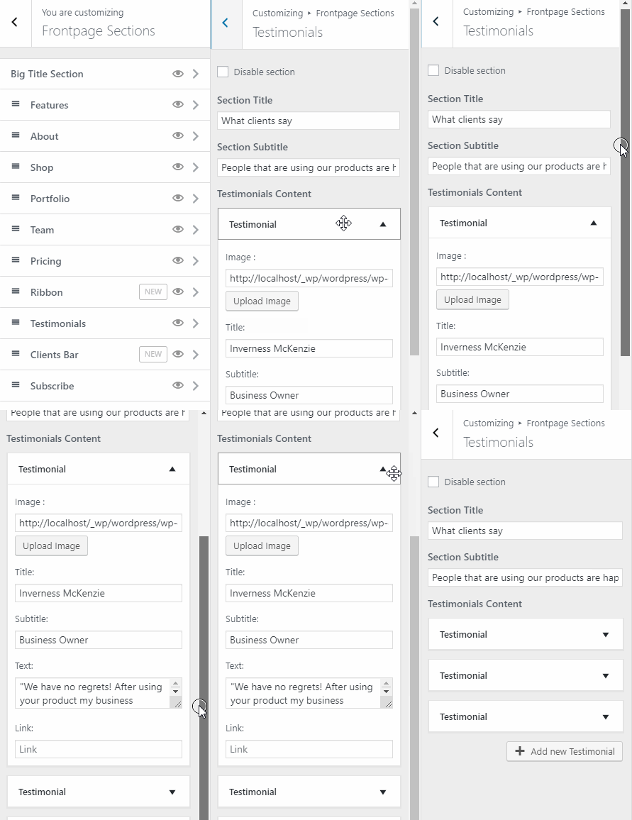
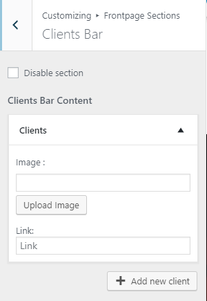
Clients Bar Section - Allows you to display the logos of your clients. Links to their respective websites or social media pages can also be added, in which case the images will become clickable.
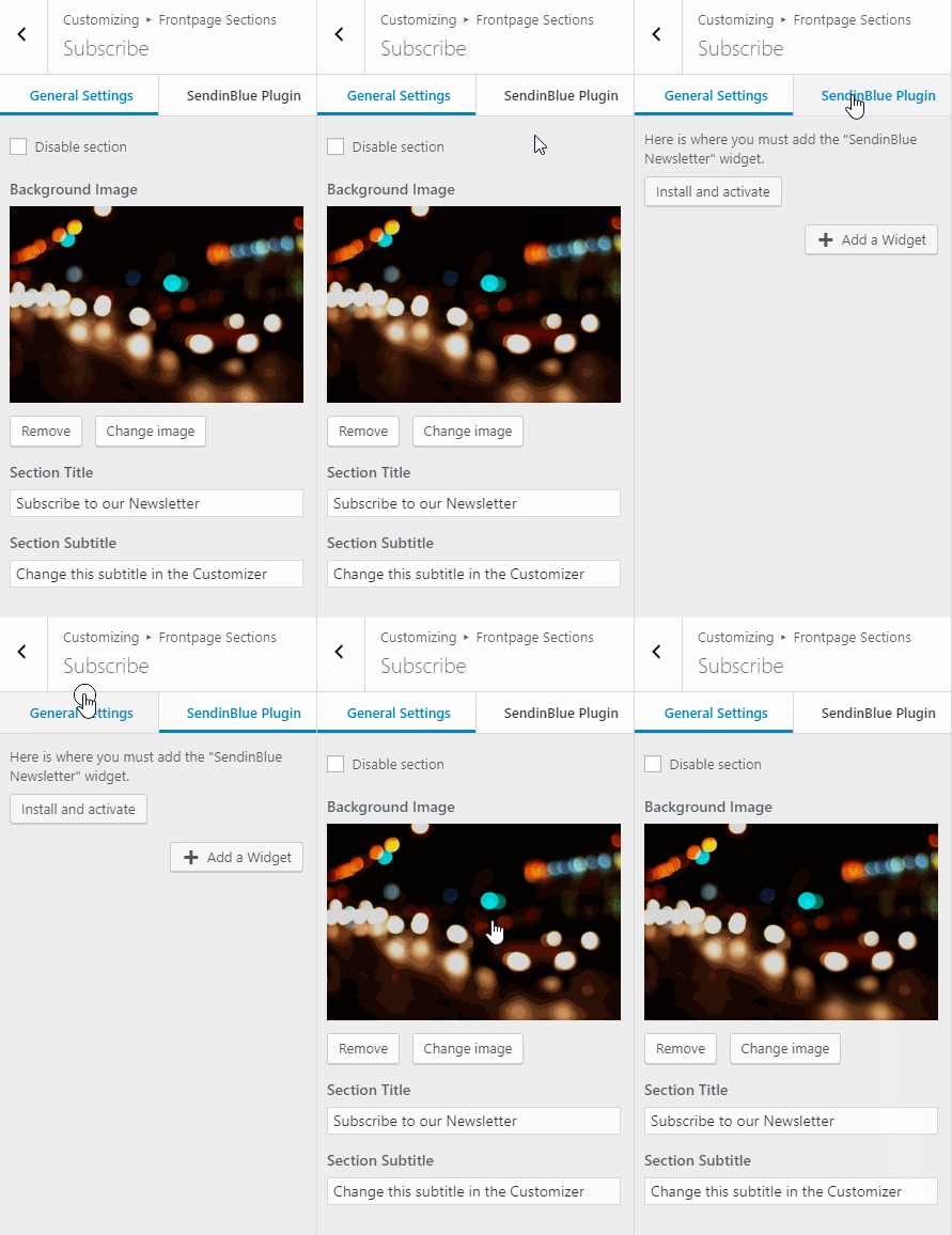
Subscribe Section - Can only be used if you’re using the SendInBlue service. (If you want to check out our full review of Brevo (formerly Sendinblue - check out this article on collectiveray).
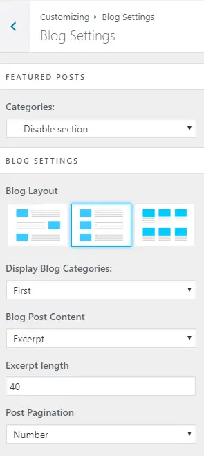
Blog Section - Lets you display a specified number of posts from a particular category.
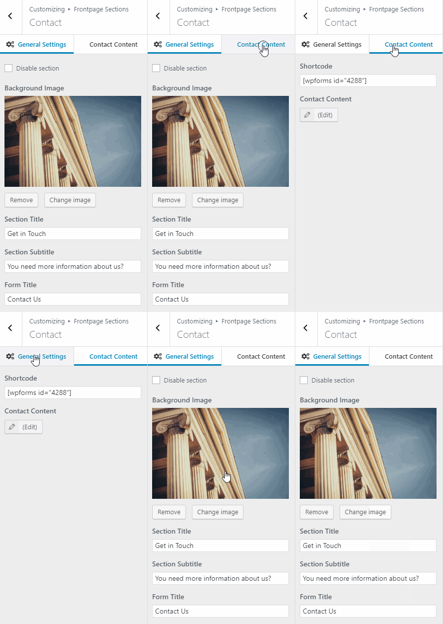
Contact Section - Lets you add a contact form using any popular contact form plugin. All you need to do is to set up your form, pick up its shortcode and paste it in this section and you’re all set.
You can add additional content on the left side of the section via the built-in post editor.
That’s all of the available sections as of this writing.
Next, we’ll check out Hestia Pro hooks which we have mentioned several times during this article.
Hestia Pro Hooks
This powerful feature allows you to insert text, HTML, javascript, shortcodes and even PHP code in various parts of the theme.
This gives you lots of freedom and power to further customize it to your liking.
The content you add to hooks (except the hooks that appear before or after a section) not only shows up on the front page but also on other pages as well.
You can see all of the available hooks and filters here and a visual representation of them here.
We’ve now covered the major features of the theme! Next, let’s check out its customization features.
Ease of Use
Having spent a few hours with the theme and having built a test site with it, we would say it’s very easy to use.
It isn’t as intuitive as Astra for example, but it’s logical to use, tools are easy to find and to use.
The Hestia dashboard is great. It has five tabs, Getting Started, Useful Plugins, Support, Changelog and Sites Library.
Each has relevant content in each and you’ll probably spend most of your time in Sites Library until you choose a template.
Useful Plugins is a quick way to install dependencies, but they are all purely optional.
Hestia mimics the WordPress block editor so will be familiar to anyone who has customized a page using the edit function.
Menus are all on the left and any changes are reflected immediately in the center.
It’s a simple, yet intuitive way to work and keeps Hestia powerful but accessible at the same time.
Page Builder Integration
Hestia is following the pack with page builder integration. It says it is compatible with Elementor, Brizy, Beaver Builder, Visual Composer, SiteOrigin and Divi Builder.
We tested it with Elementor and the WordPress block editor and it works perfectly fine with both.
We’re big fans of Elementor and love how simple it makes customization. However, we actually found ourselves preferring to work within the WordPress block editor with Hestia.
There’s something about the simplicity of the menus and controls that kept us working in the editor.
Your experience may differ of course, but you have the confidence knowing Hestia will work with whatever page builder you care to use.
Customization
With Hestia, you can access all customization options through WordPress customizer.
Everything from your site’s font colors to its typography has the option to be customized by going to Appearance > Customize.
Let’s walk through these customization options.
Appearance Settings
First, we have the Appearance Settings. Here we find the options for customizing your site’s typography, colors, sidebars, etc.
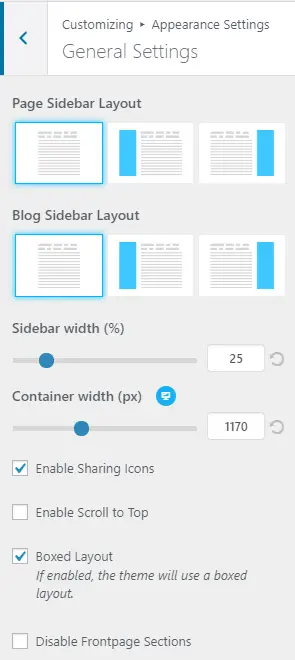
In this section, you will also find the option to toggle front page sections, scroll to top button and the box layout.
Next up we have the typography settings where we can configure several typographical options such as the font size and font family used throughout your site, separated via different tabs.
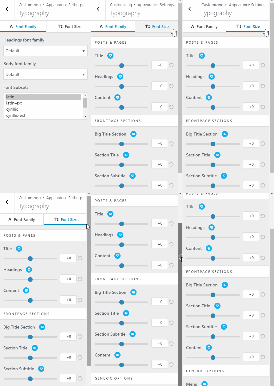
The font family tab is pretty self-explanatory - the font size tab is where you’ll find something odd.
If you want to change your website font’s size, you’ll have to choose between -25 and +25, which is a little vague.
Where does the theme base the sizes from? It would’ve been better if they used pixels here instead.
Checking the font size via Chrome’s inspector tool returns a size of 10px on -25 and 37px on +25. The change isn’t linear.
Next is the color settings where you can customize the colors of various theme elements.
You can customize the background color, accent color (affects all buttons), body text, etc.
For the navbar, you can edit the text color along with the hover color and more.
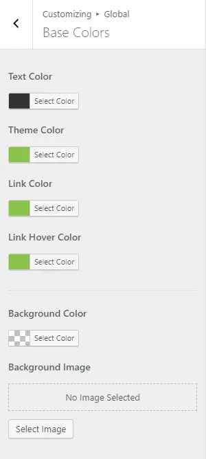
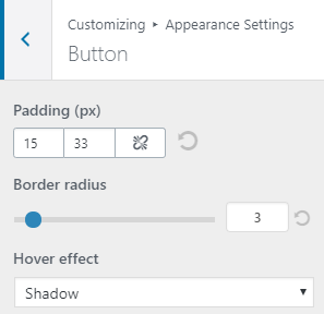
The last items in this section are the background image settings and button settings. These settings are fairly straightforward.
Do note that the button settings you set here will affect buttons sitewide.
Header Options
In the header options, we have the customization controls for the very top bar, navigation, and header settings.
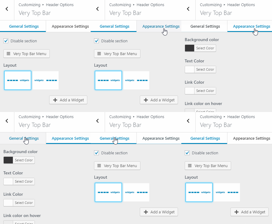
The very top bar contains options for adding a menu or widget content at the very top of your website (above the header).
It has two layout options and a panel for customizing its colors.
We have the navigation settings which contain layout and menu related settings. Here is where you can customize the appearance of your site’s navigation.
There are three layouts to choose from, with one of them allowing you to add a widget of your choice.
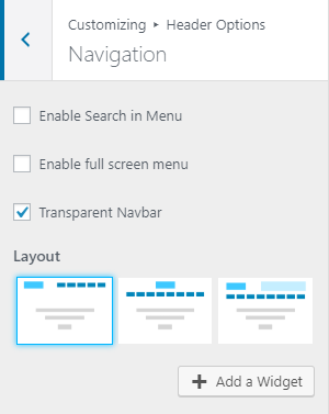
There are also additional menu options such as hamburger menu toggle and search icon.
Finally, we have the header settings which contain the options for customizing your website’s header layout. It comes with separate layout options for posts/pages and product pages.
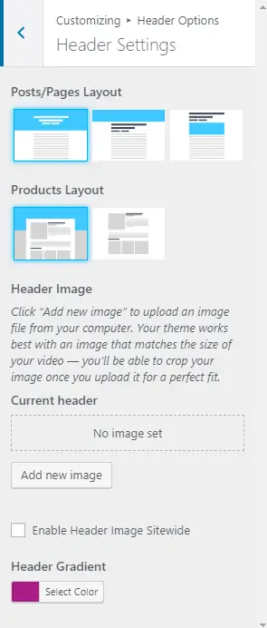
You can customize your header further by adding a header image. You can also toggle whether to enable this image on a sitewide basis or not.
Normally, header images for blog posts will display the featured image. Choosing to enable header image sitewide will replace all header images with the one you specify.
If you didn’t upload a header image, then you can make use of the last setting here, which is the header gradient. Keep in mind that the header image will override this setting.
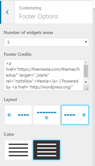
Footer Options
The section contains modest customization options for your site’s footer. You can configure the number of widgets, footer credits, layout, and color.
 Blog Settings
The blog settings are subdivided into three sections:
- Authors section
- Blog settings
- Subscribe section
In the authors section, you can select who you want to be displayed at the bottom of your blog archive pages.
You can also choose to set a background image if you want to.
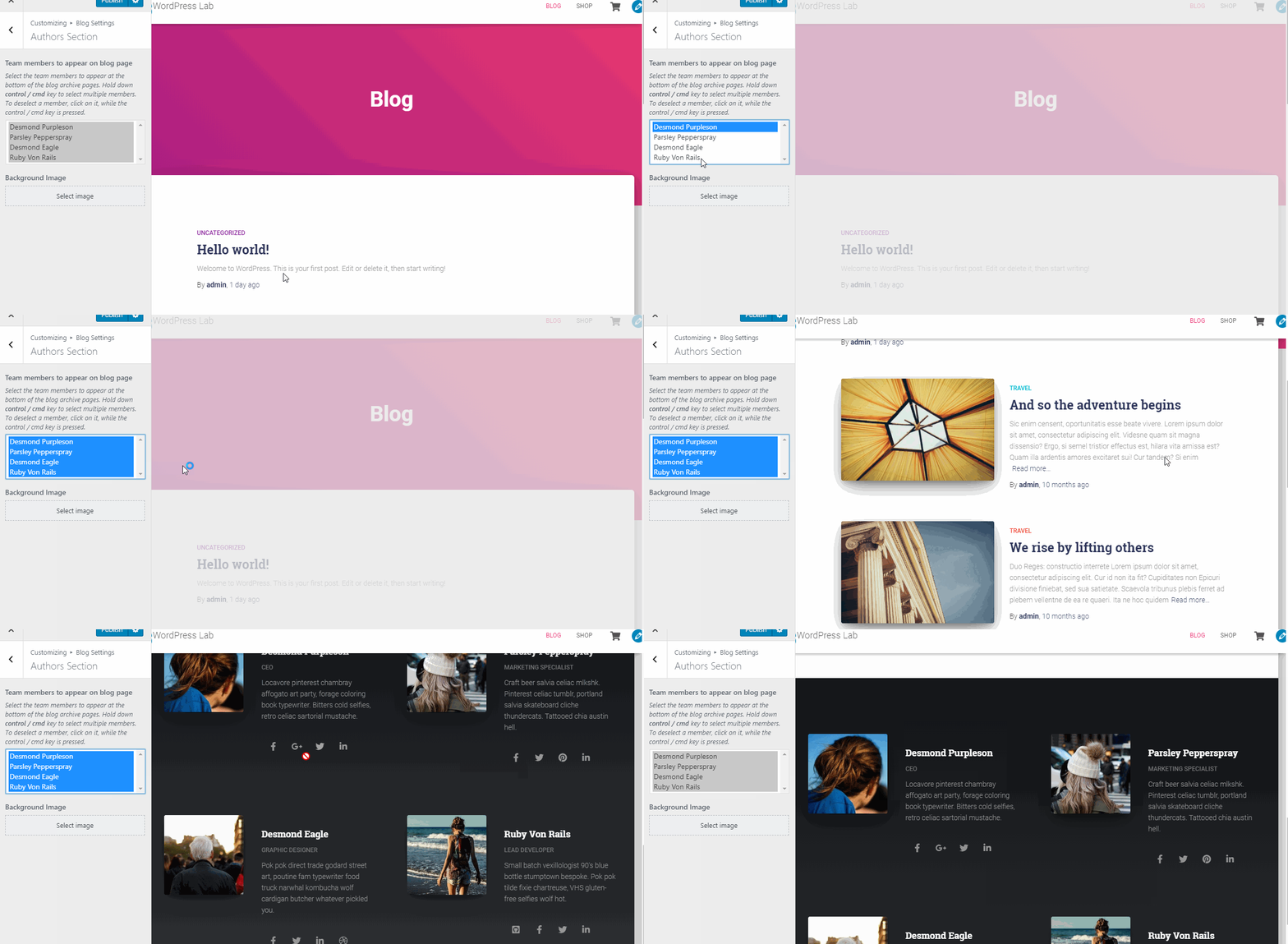
In the blog section, you can configure your blog archive page layout, featured posts and other related settings.
Lastly, in the subscribe section you can use your SendInBlue account to display the campaign of your choice.
Shop Settings
This section provides customization options for your WooCommerce pages.
You’ll find the options to configure your product style and product hover style; choose whether to use numbers or infinite scroll pagination and other toggles.

White Label
The white label option allows you to hide any reference to Hestia and ThemeIsle in the theme’s admin dashboard.
This option is useful if you’re using the theme for your clients and you want to use your own company’s name instead of Hestia/ThemeIsle.

There are two ways to utilize this setting.
The first is by filling out the fields with the info you want and then hit save changes. It will now replace all instances of Hestia/ThemeIsle references within the theme’s UI and replace it with the one you set.
Make sure you toggle the white label option only AFTER filling out the fields with the necessary information.
This is because after switching on the option, the white label setting becomes inaccessible, completely hiding the fact that you’re using Hestia theme for your non-savvy clients.
If you want to access the white label settings again, you have to deactivate and reactivate the theme.
And with that, we're done with all the customization features Hestia Pro has to offer.
Truth be told, it’s a little bit lacking compared to other premium themes, but it gets the job done and it offers more convenient access to every customization option along with live editing features.
In reality, the strength lies in two things: the power to create a highly flexible and customizable single-page websites without being overwhelmed with options and features.
This keeps the site lean and highly performant as we saw from the speed tests.
In the next section, we’ll check out the support and documentation offered by the vendor for this theme.
Support and Documentation
We’ve seen the theme’s features and customization options, it's now time to see how good their support and documentation are.
Documentation
Their documentation is very well written. It covers every single detail about their theme’s options. However, there are still some items that are not covered.
For example, they don't clearly explain how to “reuse front page sections” in other pages.
There is nowhere in the documentation that says you need to use Elementor to display the front page sections on other pages and they also have no written article explaining that some elements of certain front page sections won’t be displayed if they are reused in other pages (which we’ve covered earlier).
Further, they indicated in their Pro vs Free comparison that you can “reuse” front page sections.
This description is a little vague and people might think that by “reuse”, the devs mean you can use front page sections on other pages and add content in it, but no.
What they meant by reuse is you can display a copy of a certain front page section on other pages. This is not clearly indicated.
Another thing we found annoying is that their Pro documentation doesn’t have navigation just like in their Free version documentation.
It makes browsing a pain, especially when everything is on one page. At the very least, they should’ve added a table of contents at the top.
Documentation Quality
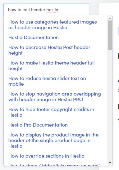
If you need help with a particular item, however, you can easily find it using the search bar on their documentation page.
Be sure to add the “Hestia” keyword or else, the search will return results from other themes as their documentation page includes the documentation for all of ThemeIsle’s themes and plugins.
The explanations are very clear and are accompanied by images and animated GIFs to help you clearly understand the item.
Everything is on one page, so you won’t have to click, search, etc. to find what you need.
The downside is in their Pro documentation, which we already discussed earlier.
Overall, their documentation is very well written and easy to understand. If they add navigation in their Pro documentation, it will certainly be among the most comprehensive and user-friendly docs out there.
Support
According to their Free vs Pro page, Pro users get answers to their questions within 5 hours.
While if you are working on something and get stuck, 5 hours might seem to be a little slow, you'll find that most Pro users are surprised about the speed and dedication of ThemeIsle’s support team.
In reality, a 5 hours response time is very good, verging on response times for large-scale, expensive maintenance agreements.
You can see from their Facebook review page that they will certainly reply to your queries most of the time.
As a premium user, if you encounter a problem that is not covered by their documentation, open a support ticket and you’ll certainly have your questions answered.
Free Support
They are also fairly active in the WordPress support forum, although premium users can’t post their questions here since it’s dedicated to free Hestia users only.
They’ve also stated that they do not monitor the free version forum daily since they prioritize premium users.
Overall, their support is fast and reliable. You can never go wrong with support with Hestia Pro!
Now that we saw how satisfied users are in Hestia both free and pro, in the next section, we’re going to summarize everything we’ve learned about Hestia Pro via Pros and Cons next.
Pros and Cons
In this section, we're going to highlight the things we liked best and pinpoint some of the things we didn't like while using this WordPress theme.
Pros
- Powerful front page options and customization
- Deep integration with Elementor
- Centralized customization
- Live editing
- Advanced customization via Hestia Pro hooks
Cons
- A little lacking in customization options
- Site library contains very few templates to choose from
- Frontpage section text editors could use a little bit of improvement
Overall, it’s one of the best one-page themes in the market at the moment.
While it lacks in terms of overall site customization features, this is offset by giving you easy to use tools to build a compelling front page or landing page.
Let's now look at the pricing and how much it will cost to buy and renew the product.
Pricing
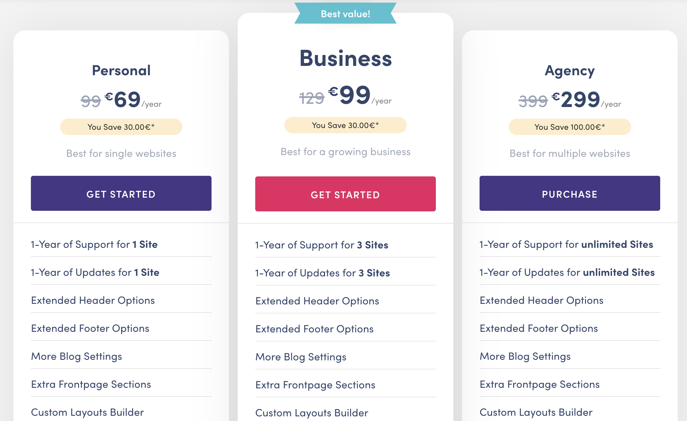
Hestia Pro comes with two pricing options: annual and lifetime.
Each pricing option comes with three different plans:
- Personal
- Business
- Agency
Personal Plan
- $69/year
- Can be used for a single site only
- Comes with support and updates for the duration of the plan
- Ideal for anybody whose main line of business is NOT designing websites
- No access to Pro starter sites
Business Plan
- $99/year
- Can be used on up to 3 websites
- Access to Pro site templates
- Comes with higher priority support and updates for the duration of the plan
- Good for businesses creating multiple websites for themselves
Agency Plan
- $299/year
- Can be used on unlimited websites
- Good for freelance designers and agencies
- All of the previous plan’s features plus:
- White labeling
- Live chat and priority support
Overall, the prices are pretty much in line with the rest of the industry and are GOOD value.
But with 10% OFF for CollectiveRay customers, prices go from good to GREAT!
If you're only planning to build one website, we'd recommend going for the lifetime option, because support and the latest versions are very important for the security of your website (outdated themes can result in your website getting hacked).
If you're an agency or designer, we usually recommend going for the highest tier (lifetime), because besides the support and updates, you can charge each client where you use it the price of the personal plan price.
This reselling over and over again results in a decent margin being made.
Of course, lifetime makes sense to make sure you get access to the latest updates.
So grab a bargain while this offer 10% OFF offer for CollectiveRay customers lasts, there is a limited number of these discounts and they're running out fast!
In the next section, let’s solidify the belief that Hestia Pro’s is good value for money by checking out some user testimonials or reviews by other bloggers.
Testimonials/User Satisfaction
There aren’t too many reviews about Hestia Pro out there, (on other blogs such as ours) so it can be hard to find independent reviewers and what they think about the theme.
Then again, if clients, who have paid for the software are happy, then it's all great.
So, we’ve scoured the internet for you to find out what people say about the theme and its developers.
The theme has been rated at 4.8 out of 5 stars in the WordPress theme repository (as at the time of writing), Hestia is certainly loved by its users. 237 out of 271 users have given it a 5-star rating, with only a negligible 14 reviews which are 3-star or less!
Many reviews of the free version are positive, you can check them out here.
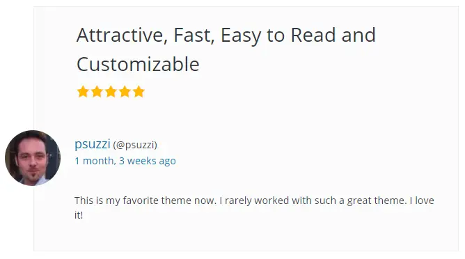
Here are some of the comments in the reviews:

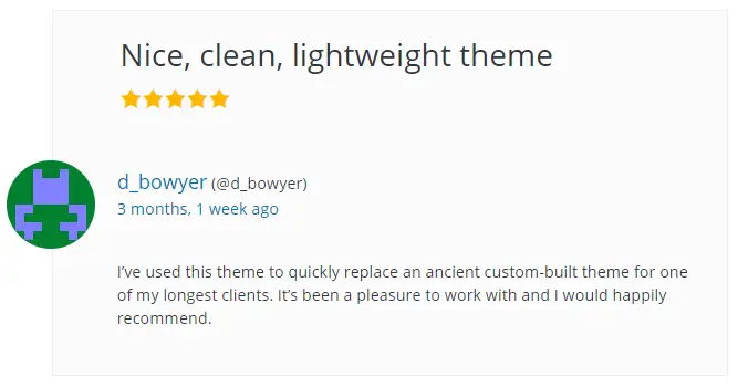
Additional testimonials can be found on ThemeIsle’s Facebook page.
Many are speaking very positively about how great customer support is (and there are many users who said that they are using Hestia for their projects).


While you can see a few negative reviews in the WordPress forums and their Facebook page, they’re just a handful compared to the overwhelming number of positives…
It would be weird if we didn’t see any negative reviews at all right? Somebody is bound to find something to complain about :-)
You now should have a decent idea of whether this is the right theme for you.
In the next section, however, we’re going to first take a look at some of the example websites built using Hestia so you can have a more practical feel of what result you can achieve with the theme.
IMH
Do you want a fast website?
Who am I kidding? Don't we all?
So why do so many of us struggle?
The biggest challenge is usually finding a fast, reliable hosting company.
We've all been through the nightmares - support take takes forever or doesn't resolve our problem always blaming something on your side...
But the biggest bummer is that the website always feels slow.
At CollectiveRay we host with InMotion hosting and our website is stupid fast. We run on a custom stack of LightSpeed server setup on MariaDB with a PHP7.4 engine and fronted through Cloudflare.
Combined with our front-end optimizations we reliably server 6000 users every single day, with peaks of 50+ simultaneous users.
Want to get a fast setup like ours? Transfer your site for free to InMotion hosting and get our 50% OFF on current pricing.
Try InMotion Hosting with 50% OFF for CollectiveRay visitors in April 2025 ONLY!
Hestia Examples/Starter Sites
You probably now have an idea about what your site would look like if you used this theme, but those ideas are probably still vague, so we’re going to showcase some of the theme demos and live sites built using Hestia.
This will give you a much better understanding of what you can build with Hestia.
1. Hestia Original Theme Demo
This is the default theme demo and is also the one you can easily and readily import to your site, free or pro. Get a full view here.
2. Hestia WooCommerce
This one showcases the WooCommerce integration. Get a full view here.
3. Hestia Energy Panels
A one-page website for a company that specializes in solar panels. Get a full view here.
4. Hestia Vet Center
Showcases the use of Hestia for a medical site. Get a full view here.
5. Hestia Zelle
Another excellent demo showcasing how you can use the theme to build an eye-catching site. Get a full view here.
6. Hestia Lawyers
A PRO-only template, this demo makes use of the premium front page sections. Get a full view here.
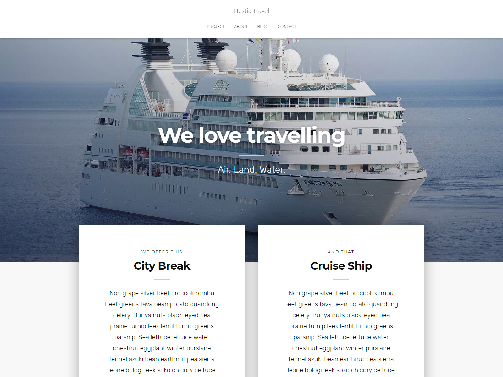
7. Hestia Travel
This one incorporates Elementor page builder into its design. You can see the page builder element by getting a full view here.
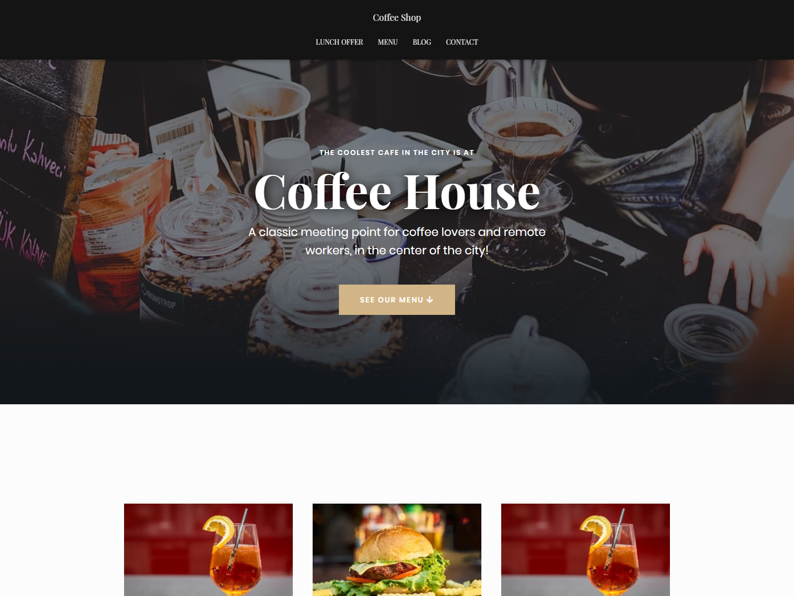
8. Hestia Coffee Shop
This is another one that puts great emphasis on the use of elementor. Get a full view here.
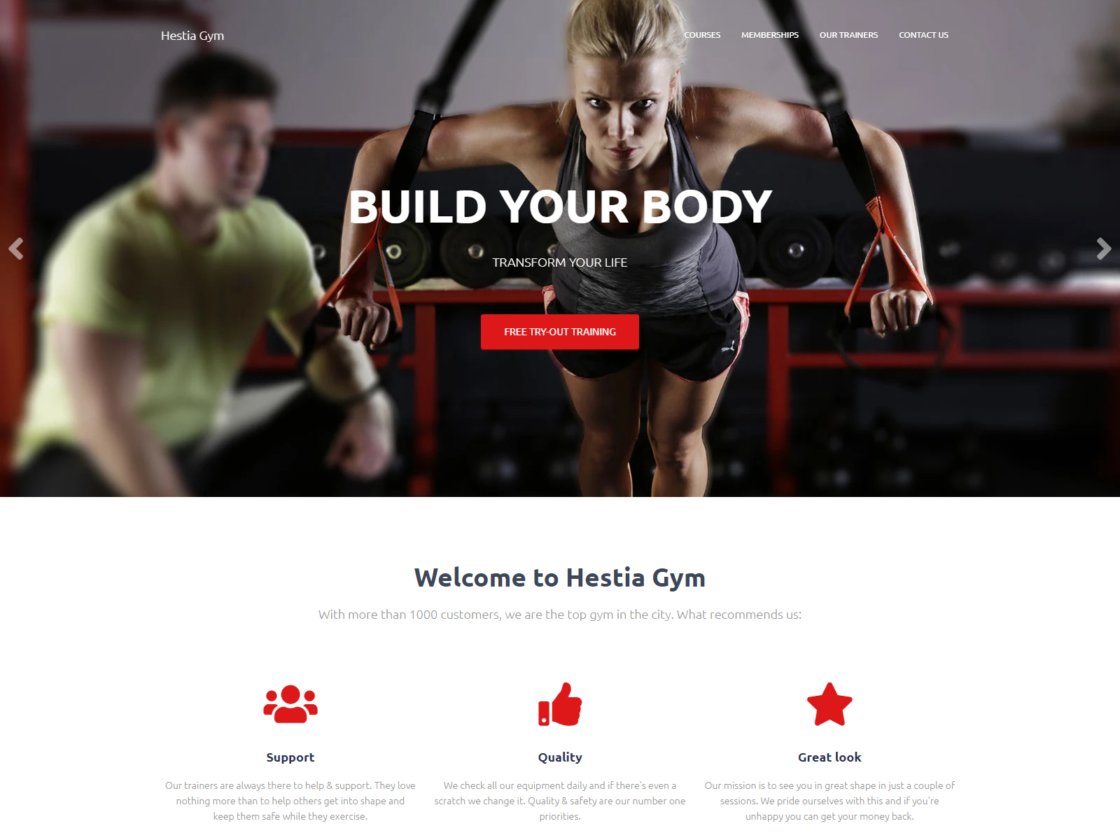
9. Hestia Gym
Another PRO-only demo, this time for the fitness niche. Get a full view here.
10. Egham Museum
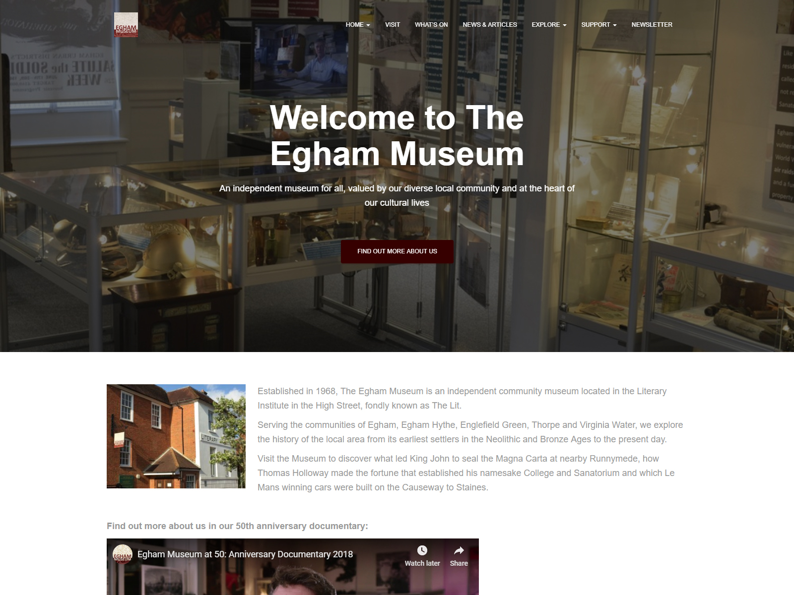
What we’ve showcased so far are the templates that you can get from the Site Library. This one, however, is a live site using the Hestia theme. Check it out here.
11. 2 Fitness Lovers
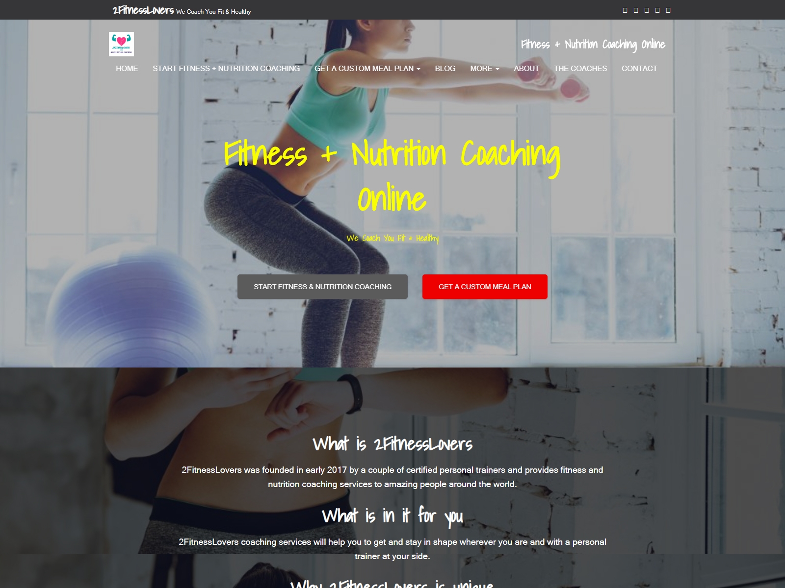
Another live website using the theme. This one is a fitness website. Check it out here.
12. Don Corgi

And last but not least on our live site example, Don Corgi. Check it out here.
With that amount of demos and live sites combined with our review, you should pretty much have a good idea of what you can do with the theme.
In case you’re still not satisfied and want an alternative, we’ve still got you covered! We’ll tackle some great alternative themes in the next section.
Alternatives to Hestia Theme
Although we do believe Hestia Pro is a great theme, the industry offers quite a few other options. If you'd like to see what else is out there, here are a few other good products which can be used as alternatives!
Of course, they may not offer the same features but are viable alternatives. We've also reviewed a number of these on CollectiveRay.
GeneratePress
A fast, lightweight and minimalist theme, GeneratePress emphasizes speed. Its pricing is also very generous - for only $49 you can use the premium version on all sites you own.
It utilizes modules to control what features you want to use. There are modules for typography, site library, and many others.
Furthermore, they have the reputation of having an excellent (probably the best) support.
Check it out here.
Astra
One of the best free themes, Astra comes with a massive selection of ready to use site demos. It’s deeply integrated with Elementor, Beaver Builder and Brizy, in fact, if you want to use page builders as a primary means of building your site, then this is a great choice.
Like GeneratePress, it uses modules to activate/deactivate certain premium features.
It also comes with powerful addons for Gutenberg, Elementor and Beaver Builder making it one of the best choices for creating a page builder powered website. Incidentally, do check out our Elementor vs Divi comparison.
Check it out here.
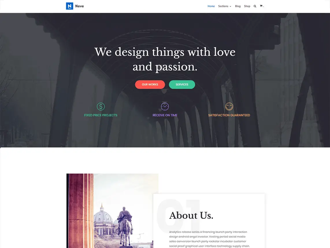
Neve
Also developed by ThemeIsle, Neve completes what Hestia lacks. While the latter heavily focuses on building one-page websites, Neve competes against other general-purpose themes such as the ones here.
It has more extensive customization features and better integration with page builders.
So, if you liked Hestia but you feel something is lacking, then you’ll find Neve the perfect alternative theme for you.
Check it out here.
Conclusion - should you use Hestia theme?
In our Hestia theme review, we have concluded that Hestia is one of the best themes to choose when it comes to building websites that need to have a beautiful homepage or landing page.
It's not entirely a multipurpose theme, it focuses on giving its users the toolset on building a magnificent front page or homepage and it does it very well.
The developers themselves are emphasizing it on the theme’s product page.
If you are looking to build a one-page website or if you want a website that can hook your target audience right at the homepage, there’s no better choice than Hestia PRO!
Visit ThemeIsle To Download Now and get 10% OFF if you go for a PRO plan

